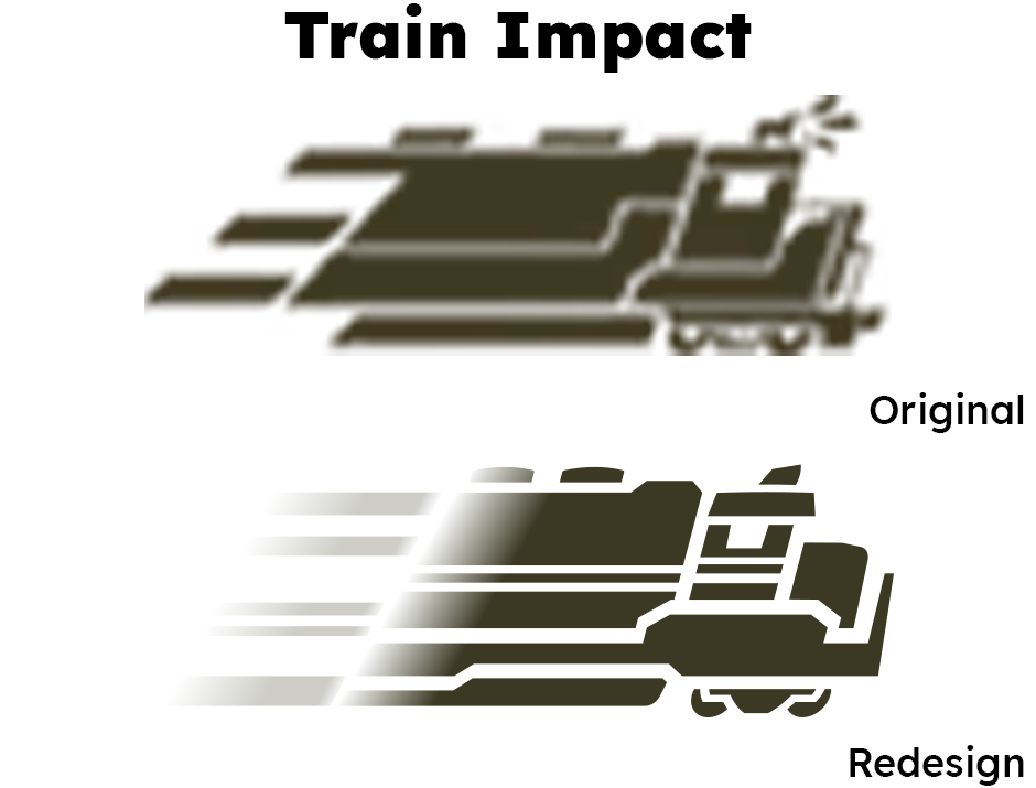
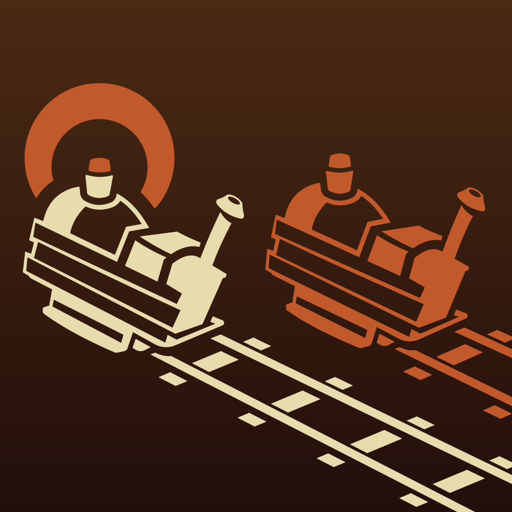
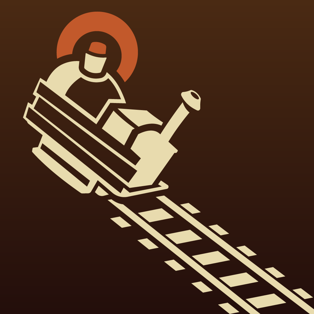
I redesigned some environmental-damage icons, like this train, to more closely resemble the in-game model. I find that transparent gradients look much nicer as vectors, which explains why the original Team Fortress 2 team tended to avoid them in 2D elements.
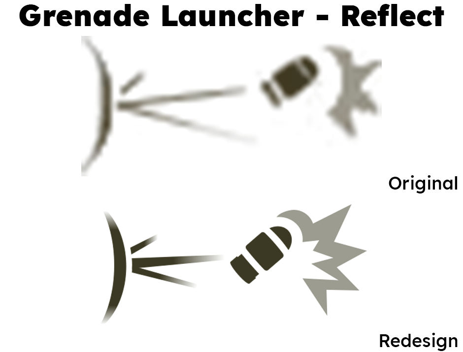
The Pyro's "reflect" combat icons could be remade without much of any redesign being necessary, except in cases where it wasn't obvious what was being reflected.
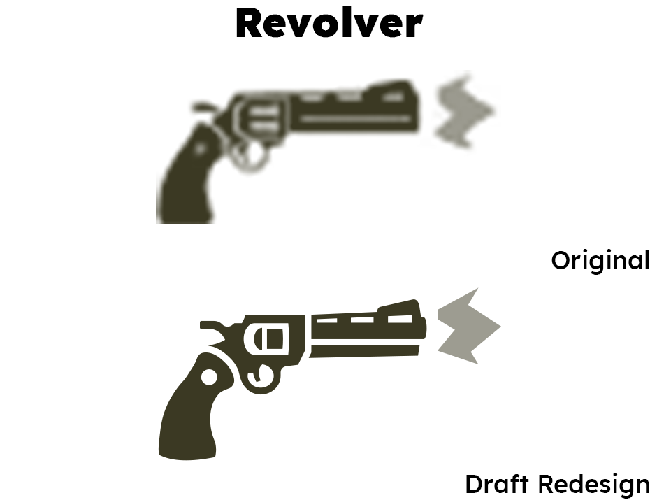
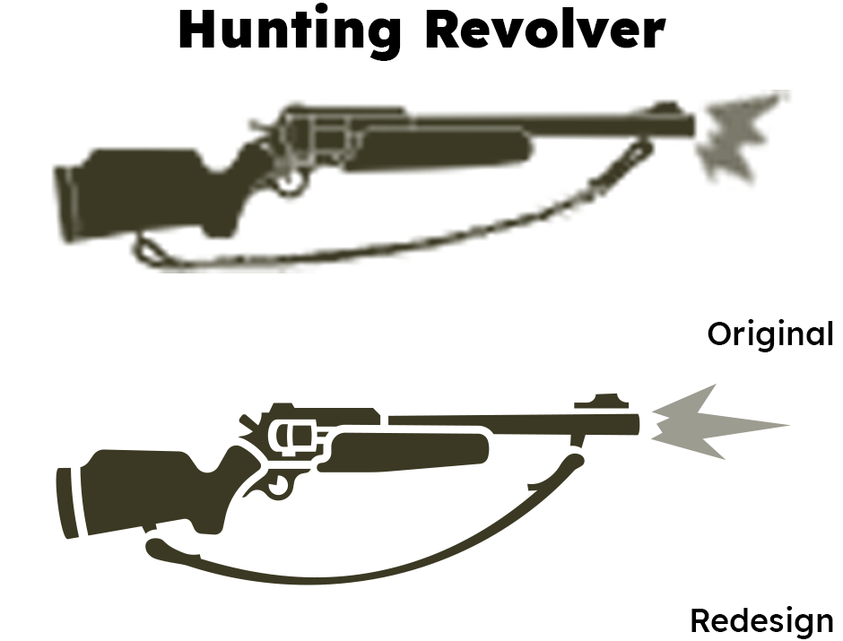
Both here and on the Hunting Revolver icon, I found a new style for the revolving chamber that is less overdetailed and still resembles a gun chamber (maybe even moreso?).
The original revolver icon uses half-transparency on the weapon's body, e.g. the circle at the top of the grip, which is something I wanted to avoid outside of the muzzle flash. These icons are meant to resemble the pictographs on road signs and hazard warnings, which tend to only be one color.
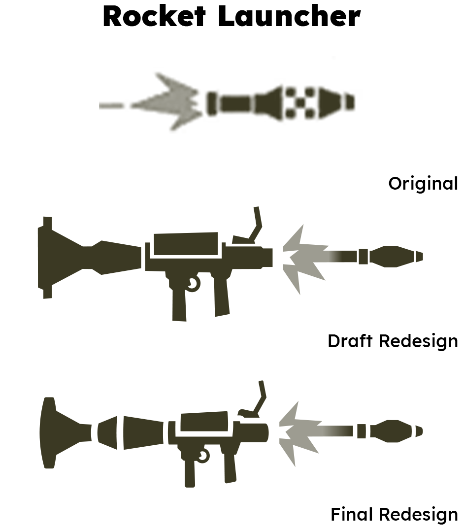
As a consistency rule, for projectile-based weapons like rocket launchers, we wanted the combat feed icon to contain the weapon itself, and not just the projectile. (This is important for when a character has multiple weapon options that both shoot rockets, for example.)
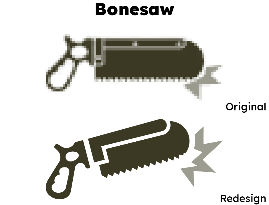
A problem I identified with older combat feed icons is that some longer weapons would appear very large, in a way that seemed at odds with how weak they were. (Since sprite icons were all 32px in height, horizontally longer icons would appear large.) Angling the weapon, like I did here with the Bonesaw, helped give it a shorter, less salient profile, and look more dynamic.
Where older icons had a flat square profile, I added rounded elements to these redesigns, particularly on gun barrels.
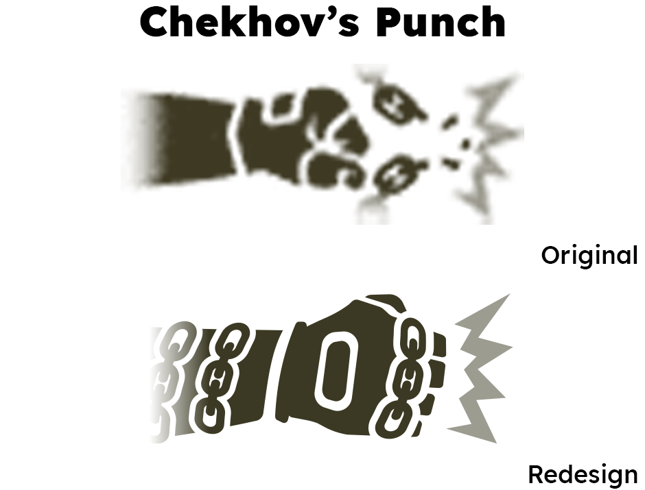
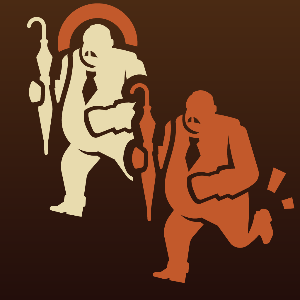
In-game, Chekhov's Punch are chains wrapped around the character's fists. The original icon (created by me when the weapon was introduced in 2022) could not convey this visually at 32x resolution, but vectors made this possible.
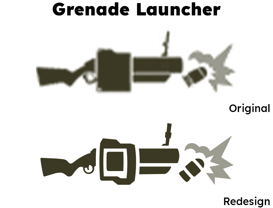
Vector icons allow for additional detail not possible in 32px sprites, like the inner chamber of this grenade launcher. The original icon also appeared far too "bulky" for such a dynamic weapon associated with knock-back and mobility, even if it was technically more accurate to the grenade launcher's in-game model.
This redesign of the Hunting Revolver icon simplified the shape, deepening the lines around key elements of the gun's profile (like the revolving chamber and foregrip) and getting rid of smaller details. This sort of "hierarchy" of detail is important in making these icons feel like the weapons they represent.
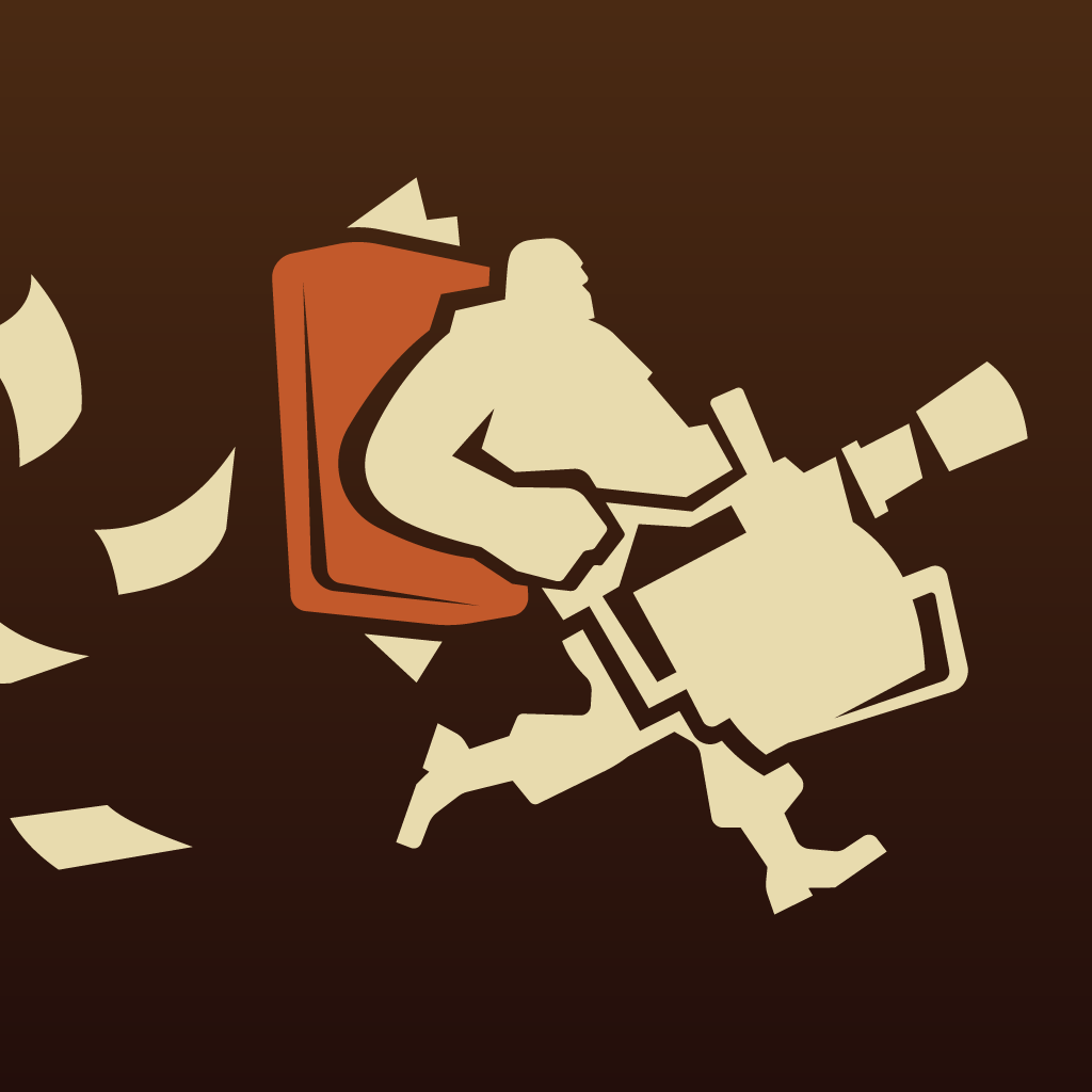
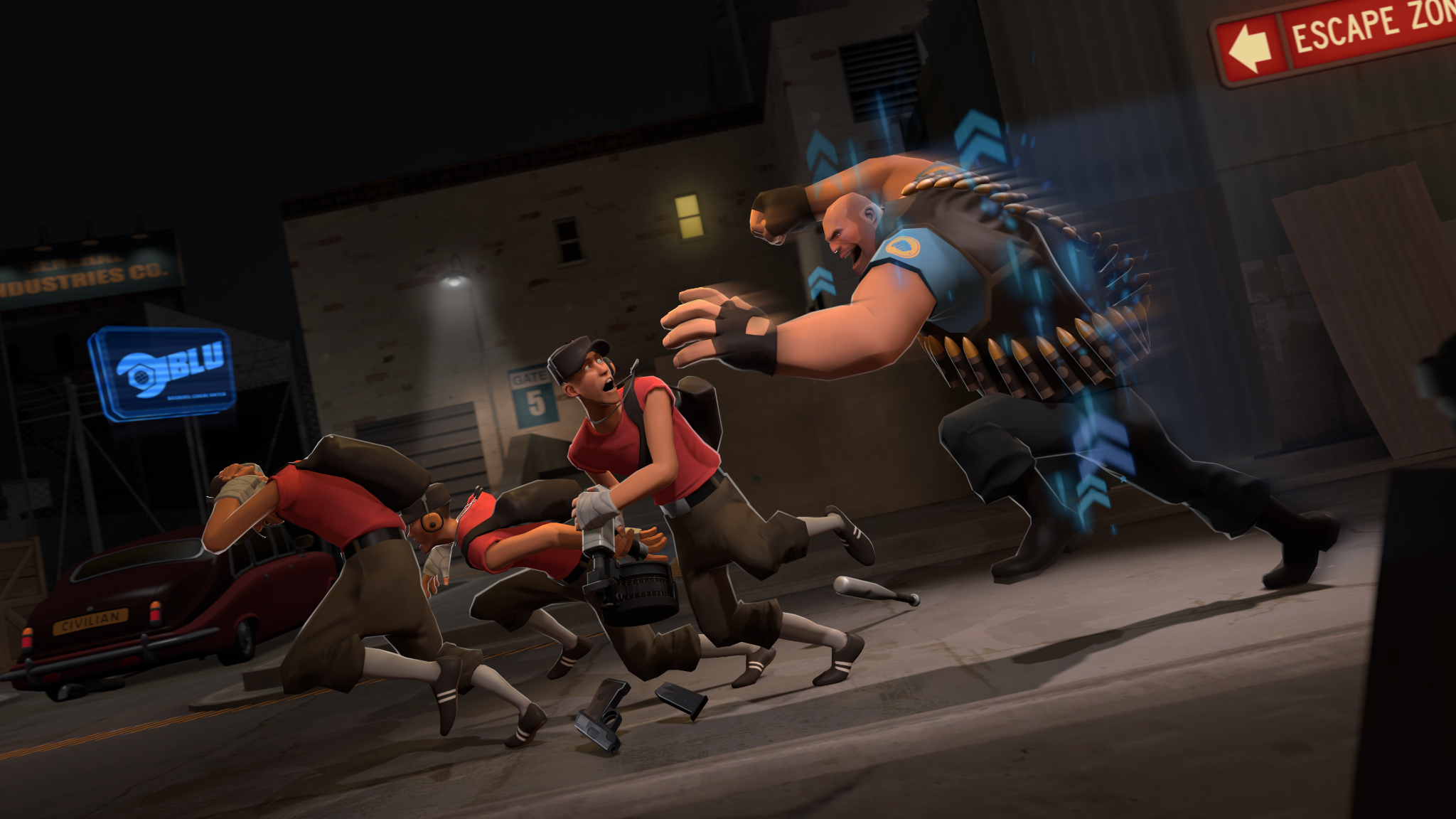
Even if a weapon looks unimpressive, I wanted combat feed icons to reflect how imposing a weapon feels to be eliminated by.